Big title section alignment after adding widgets (Hestia 1.1.75)
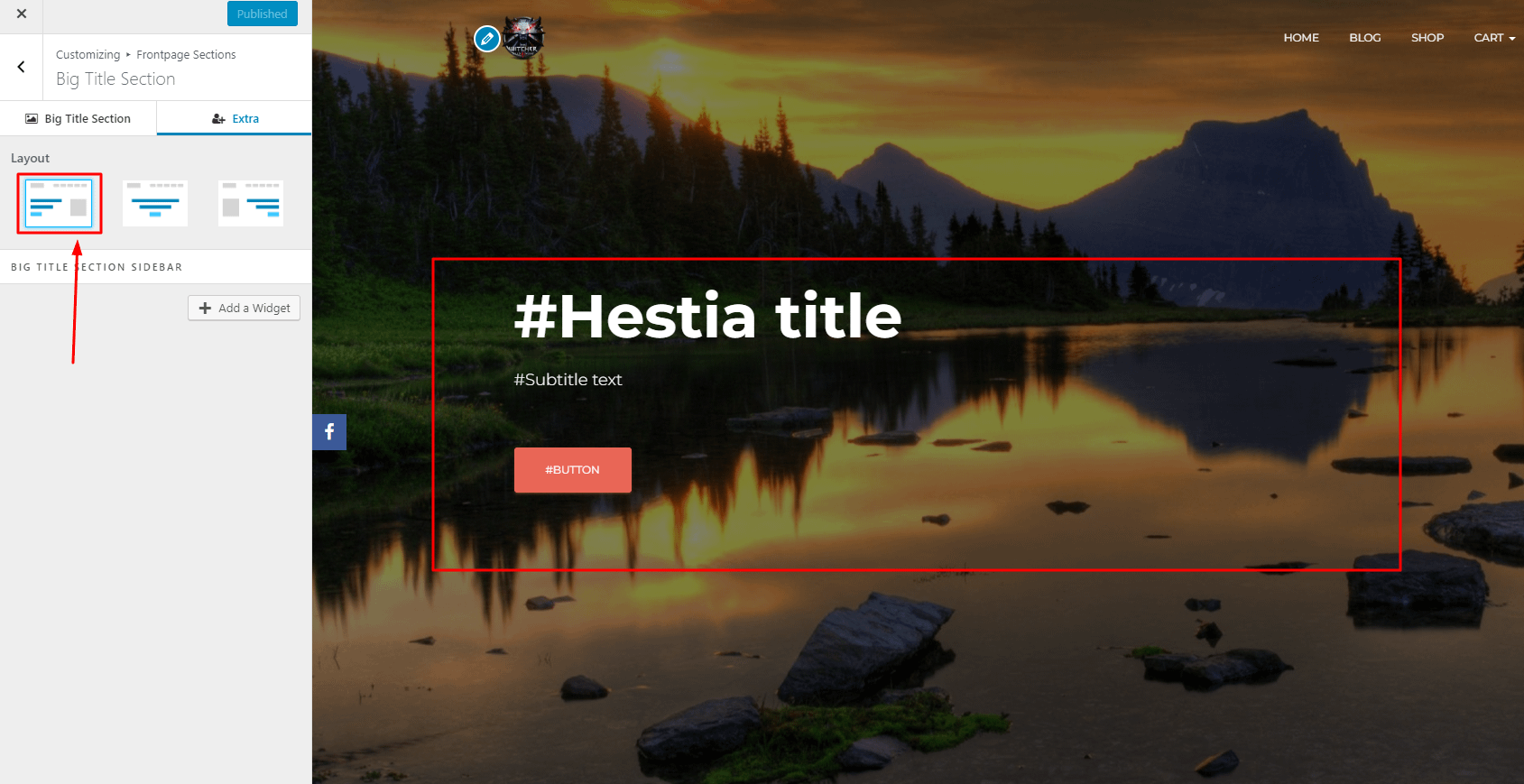
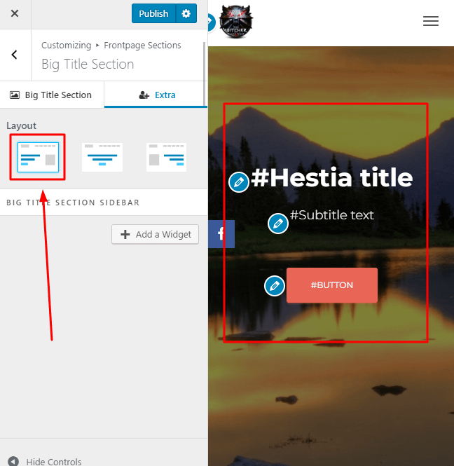
If you are using Hestia and you noticed that the Big title section's items aren't responsive to the selected layout from the Customizer, then this doc will help. Starting with v1.1.75 of Hestia we added a widget feature for the Big title section. Because of that, we needed to remove the alignment feature for the screens having the width lower than 768px, so that the lack of space would not affect the widget or other template items.
E.G. :
- Default desktop behaviour for left alignment
- Default mobile behaviour for left alignment (it is still centered)
In order take advantage of the alignment feature for mobile devices too you need to go to Appearance -> Customize -> Additional CSS and add the following code according to your preferences:
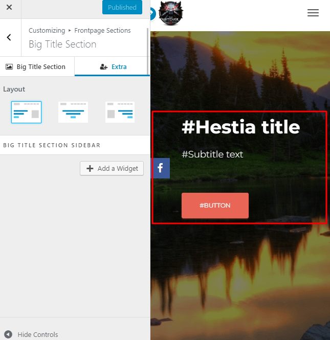
- Alignment to right:
@media (max-width: 767px){
	.carousel .page-header .row .big-title-slider-content{
			text-align:right;
	}
}
Effect:
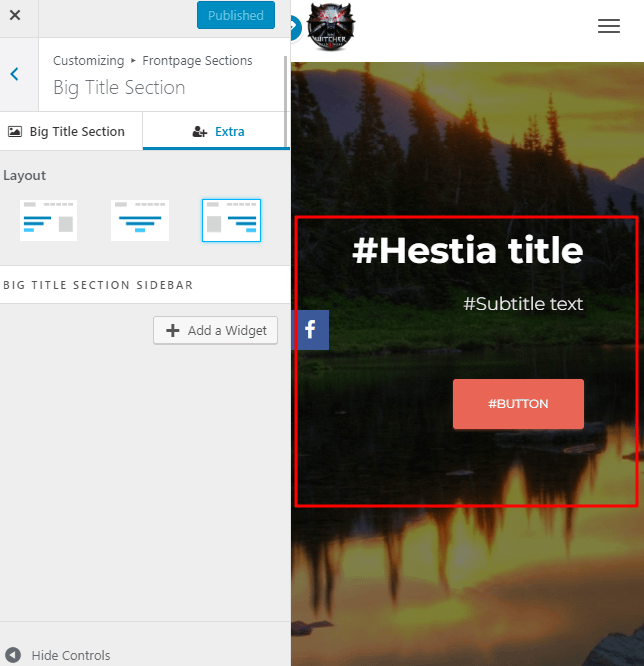 2. Alignment to left:
@media (max-width: 767px){
	.carousel .page-header .row .big-title-slider-content{
			text-align:left;
	}
}
Effect:
Note: Also, please keep in mind that this code doesn't affect or get affected by the layout settings from the customizer. The code is active only when the width is lower than 768px (on a mobile device or tablet) so selecting the layout from the customizer will only affect the Desktop view, not the view on Mobile devices.
After you're done, hit the Publish button, view the effects and that's it!