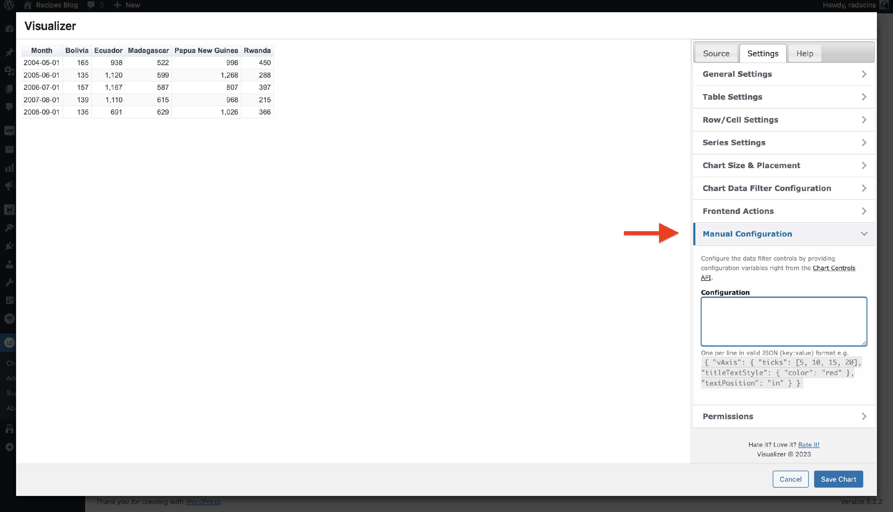
Manual Configuration
The Visualizer plugin allows you to add a manual configuration to the charts.
1. Navigate to the Visualizer > Chart Library.
2. Open one of the existing charts or create a new one.
3. Switch to Settings > Manual Configuration.
4. Paste the desired code snippets from below according to the type of chart that you use.
In this article
Google Charts
Create dual Y-axis
Supported charts: Area, Bar, Column, Combo, Line
- The below code will convert the first and second series into Y axis.
{
"vAxes": {
          "0": {"title": "Temps (Celsius)"},
          "1": {"title": "Daylight"}
        },
"series": {
          "0": {"targetAxisIndex": "0"},
          "1": {"targetAxisIndex": "1"}
        }
}- The below code will convert the first and second series into Y axis and customize the ticks on each axis.
{
"vAxes": {
          "0": {"title": "Temps (Celsius)", "ticks": [1500000, 2000000]},
          "1": {"title": "Daylight","ticks": [15000, 2000]}
        },
"series": {
          "0": {"targetAxisIndex": "0"},
          "1": {"targetAxisIndex": "1"}
        }
}
Customize Axis
Supported charts: All except Pie, Gauge, and Table.
- The below code will change the angle of the text to 90 degrees. Make it 0 if the text needs to be horizontal.
{
"hAxis": {
         "slantedTextAngle": 90
        }
}- The below code will change the ticks of the X-axis.
{
"hAxis": {
         "ticks": [10,20,30,90]
        }
}- The below code will change the maximum and minimum value of the Y axis without changing the data.
{
"vAxis": {
	"maxValue": 20,
	"minValue":-1
	}
}
Customize Pie Charts
Supported charts: Pie
- The below code will change how the "Other" slice works. In the default pie chart that the plugin creates, we will combine all slices that have a value of 16% and below into one slice.
{
	"sliceVisibilityThreshold": 0.16
}- Change the size of the pie hole in a donut chart and the text color so that the values are visible.
{
	"pieHole": 0.9,
	"pieSliceTextStyle":{
		"color":"red"
	}
}
Customize Gauge Charts
Supported charts: Gauge
- Change major ticks in the gauges. Provide as many strings as the number of ticks required.
{
	"majorTicks": ["tick one","tick two","tick three"]
}
Customize Text/Font
Supported charts: All except Gauge and Table.
- Change font family and font size for all text.
{
	"fontName": "Verdana",
	"fontSize": 10
}
Customize Tooltip
Supported charts: All except Gauge and Table.
- Enable HTML tooltips so that you can style them.
{
	"tooltip": {
		"isHtml":"true"
	}
 }
Add this code to the theme CSS file.
div.google-visualization-tooltip {
	/* style the tooltip here */
}
Customize Stacked Charts
Supported charts: Bar, Column.
- 100% stacked
{
	"isStacked": "percent"
}- 100% stacked, fractional
{
	"isStacked": "relative"
 }
When creating a Combo chart, the number format field is only available in the Horizontal axis settings but not in the Vertical axis settings.
This code will help users to set up a manual configuration so the number format field will also be available in the Vertical axis settings.
{ "vAxis": { "format": "#%" } }Save the changes and see if the number format is now available in the Vertical axis settings.
Change the baseline value from 0 to something else in the Combo chart
{"vAxis": {
    "baseline": 40
}}
Remove the shaded area(area opacity) in the combo chart
{"areaOpacity": 0}You can specify the chart type and color of each series for the combo chart
{
  "series": {
    "0": {"targetAxisIndex": 0, "type": "bars", "color": "#1f77b4"},
    "1": {"targetAxisIndex": 0, "type": "bars", "color": "#ff7f0e"},
    "2": {"targetAxisIndex": 1, "type": "line", "color": "#2ca02c"}
  }
}
Customize the size of the data point labels in Radar chart.
{"scales": {
    "r": {
      "pointLabels": {
        "font": {
          "size": 16
        }
      }
    }
  }}
ChartJS
Customize Pie Charts
Supported charts: Pie / Donut
- Go from Pie to Donut chart:
{
   "cutoutPercentage": 50
}
This will add a Donut Hole in the center of your Pie chart, turning it into a Donut. The value 50 is the percentage of the whole Pie chart, which will be transformed into a hole. You can customize that value according to your preferences.
- Set the rotation value
The rotation for a ChartJS Pie chart is defined as the angle from which the arcs will start showing.
{
   "rotation": 45
}
The difference can be observed from the arcs positioning.
- Customize the Pie / Donut circumference:
{
   "circumference": 6
}
This value is automatically multiplied by PI. If the value is too low, the chart will not be able to form a complete circle. If the value is too high, the chart will spin until it matches the circumference you set through this code. Here is an example of such extreme cases:
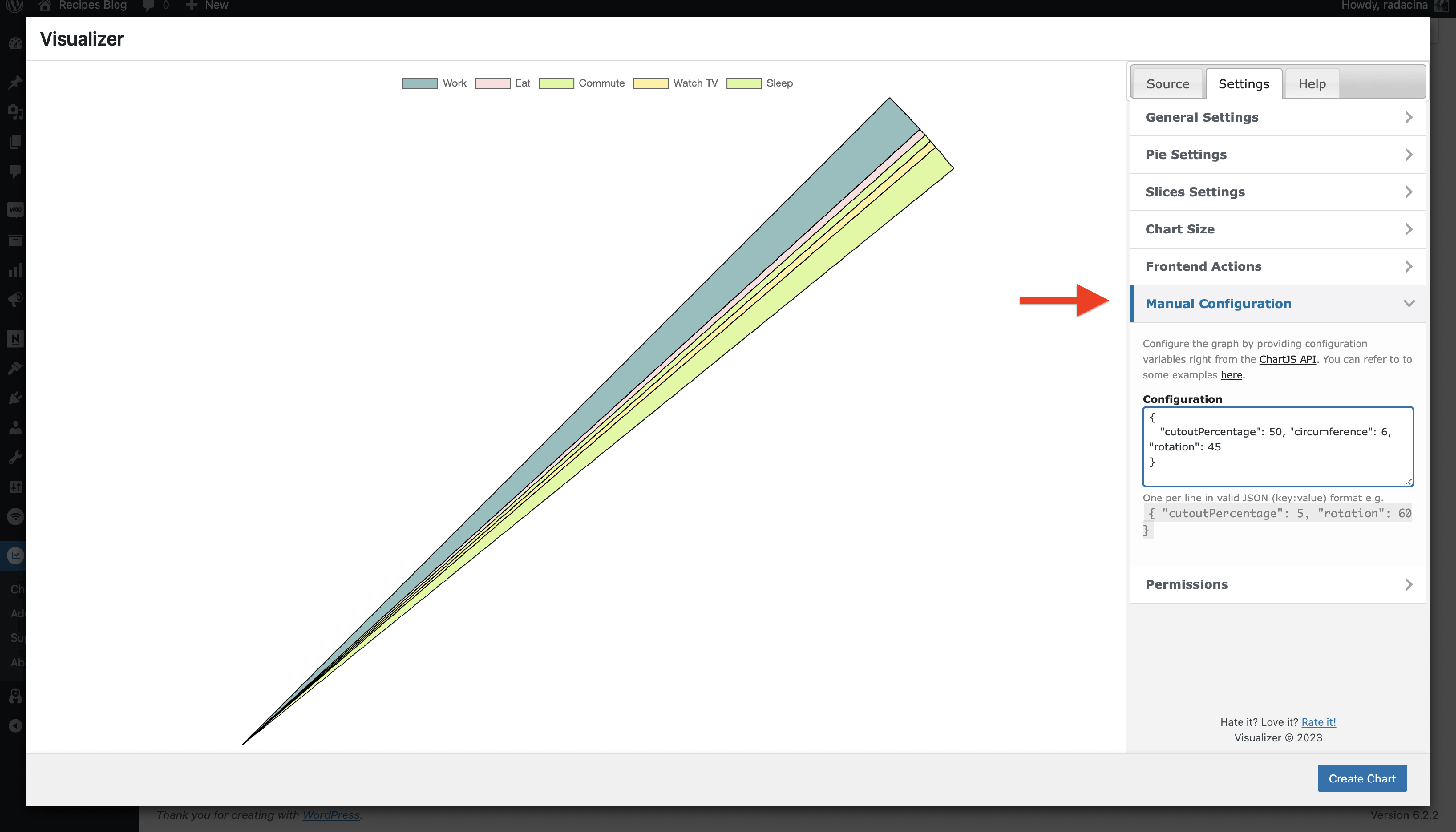
All the snippets from above can, of course, be combined and used on the same Pie Chart at once:
{
   "cutoutPercentage": 50, "rotation": 45, "circumference": 6
}
Customize Line Charts
Supported charts: Line
- Disable / Hide the Lines that connect the dots:
{
   "showLines": false
}
The default value here is true. By changing it to false, the lines will disappear, but the ticks (dots) will remain in place.
- Interrupt the lines if the data for a certain value is missing:
{
   "spanGaps": true
}
The default value here is false.
Disable the animations to improve website performance & speed
Supported charts: ALL
Chart animations, if they last long enough, might affect your page loading time and performance. If your charts have long render times, it is a good idea to disable animations. This will have the effect of reducing CPU usage and improving general page performance.
To disable animations, use this:
{
   "animation": false
}