How to use Our Focus Widgets on a custom page or post in Zelle
Important notice: This product is now in maintenance mode and is no longer being actively developed or supported. Updates and bug fixes will not be provided unless they relate to security concerns.
Many times users ask us if they could use the Our Focus widgets on another page other than the homepage. If you've tried this you might notice that the widgets show up squeezed if you use SiteOrigin page builder. Below are the correct steps to going about accomplishing this.
First step is to go to the page where you want to add the Our Focus widget and turn it into a SiteOrigin page builder page. To do this you will need to install the SiteOrigin Page builder plugin, you can have a look at this document to see how easy it is to build beautiful custom pages with it: Click here
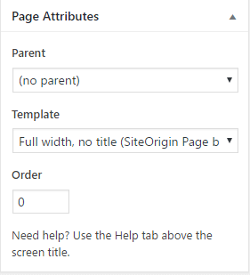
Once you've installed the plugin, create your page and give it the " Full width, no title(SiteOrigin Page builder template)":
Now switch to page builder mode by clicking on the highlighted area:
 After switching to page builder mode click "Add Row" and set the row layout to 4:

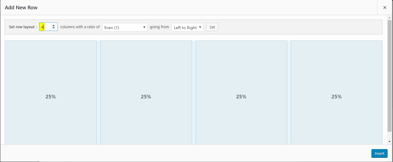
Click "Insert" and the Row will be added. Now you need to add Our Focus widgets to the row columns. To do this, click on one of the empty columns, then click "Add widget" and search for the Our Focus widget using the search box:

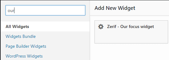
After clicking on the widget, it will automatically be added to the column you selected earlier. Repeat this step until all columns have a team member widget.
Now we need to edit the widget data by hovering over it then clicking " Edit", a screen will open up where you could enter the member's details:
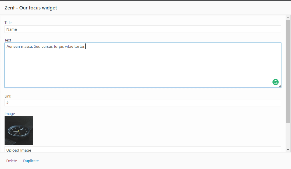
Once you're done entering the information, click "Done" and repeat the process for all widgets. Click Publish and you're ready for the final step!
Head over to Appearance->Customize->Additional CSS and add the following to the CSS area:
.siteorigin-panels .focus-box { width: 100%; }

.siteorigin-panels h3.red-border-bottom { text-align: center; width: 100%; }

/* only add the below line of code if it's already not added to the CSS area */
.siteorigin-panels .content-left-wrap { margin-top: 145px; }
Save your changes and check your website and it should look like this:
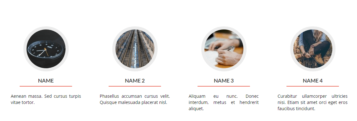
You could add as many team member widgets as you like but I recommend keeping them to a limit of 4 per row.
Now all you're missing is the border hover colors. To do this you need to add the following code to the CSS area and do a few changes:
.siteorigin-panels .panel-grid-cell:nth-child(1) .service-icon:hover { border-color: #0000ff !important; }See that 1 in the code? This means the code will only affect the first focus widget, you could repeat the code and change the number according to which widget you want to target.
If you want to have one hover color for all items then use this code instead:
.siteorigin-panels .panel-grid-cell .service-icon:hover { border-color: #0000ff !important; }You could generate the Hex color code for a color of your choice from here: http://www.hexcolortool.com/
That's all!
Having issues? Send us a ticket here: https://themeisle.com/contact/
