Setting up Lazy Loading
Super Page Cache includes a lazy loading feature that defers image loading until images scroll into view, reducing initial page load times and saving bandwidth for your visitors.
In this article
Overview
The Super Page Cache plugin provides intelligent lazy loading functionality to improve your website's performance by deferring the loading of images until they're needed. This reduces initial page load times and saves bandwidth for your visitors.
Lazy Loading Behavior Options
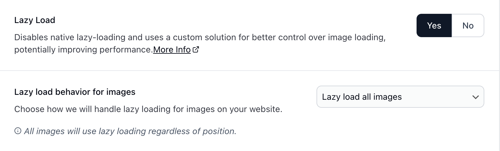
1. Lazy Load All Images
Setting: Lazy load all images
This is the most straightforward approach where every image on your website will use lazy loading, regardless of its position on the page.
How it works: - All images have lazy loading applied - Images load only when they're about to enter the user's viewport - Provides maximum bandwidth savings - May slightly delay the loading of above-the-fold images
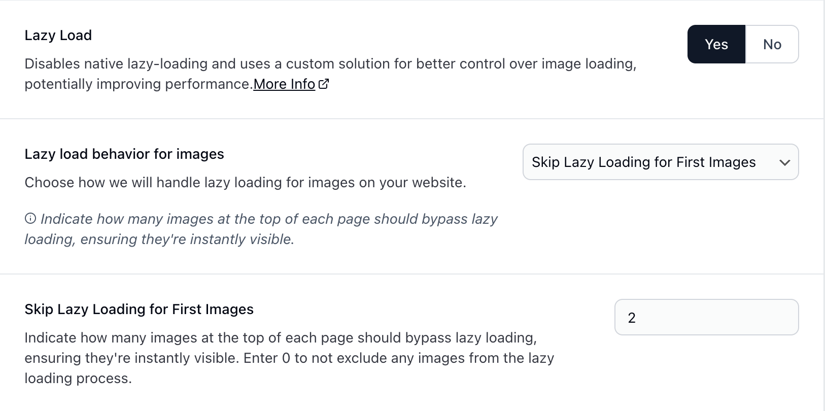
2. Skip Lazy Loading for First Images
Setting: Skip Lazy Loading for First Images
This option allows you to specify a fixed number of images at the top of each page that should load immediately, while all subsequent images use lazy loading.
How it works: - You specify the number of images to skip (e.g., 3) - The first X images on each page load immediately - All remaining images use lazy loading - Ensures critical above-the-fold content loads quickly
Configuration: - Skip Count: Enter the number of images (minimum: 0) - The plugin counts images in document order
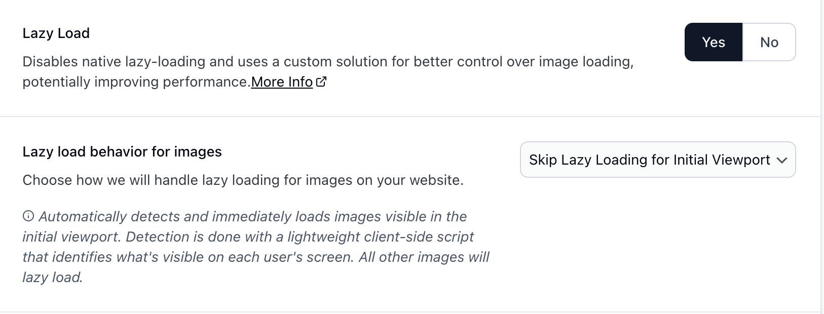
3. Skip Lazy Loading for Initial Viewport (Pro Feature)
Setting: Skip Lazy Loading for Initial Viewport
This is the most intelligent lazy loading approach that automatically detects which images are visible in the initial viewport and ensures they load immediately.
How Viewport Detection Works
Intelligent Above-the-Fold Detection
The viewport detection system uses a sophisticated client-side script that:
- Analyzes the initial viewport on page load
- Detects all elements that are visible above the fold
- Identifies images within the visible area
- Checks for LCP (Largest Contentful Paint) elements that are images
- Applies immediate loading to critical images only
Cross-Device Optimization
The detection system performs measurements for both mobile and desktop viewports:
- Desktop Detection: Analyzes viewport dimensions for desktop screens
- Mobile Detection: Analyzes viewport dimensions for mobile devices
- Conservative Approach: An image only skips lazy loading if it appears above the fold on both mobile and desktop viewports
- Responsive Safety: Ensures critical images load quickly regardless of the device used