Change the Big Title background image on smaller screen sizes in Hestia
By default, the Big Title Background image is displayed on all devices, no matter their screen size.
In some cases, it might be difficult to find the perfect sized image that will look great on all devices ( mobile, tablet, desktop). When this happens, you can use the next trick: 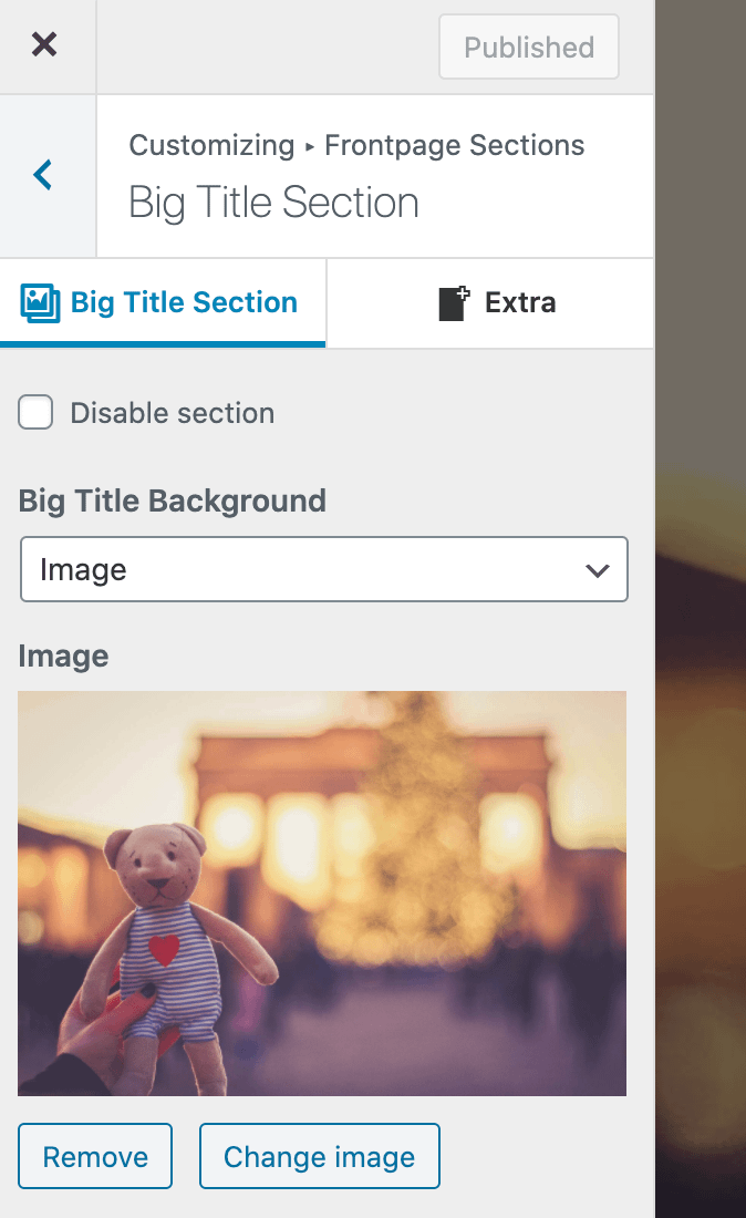
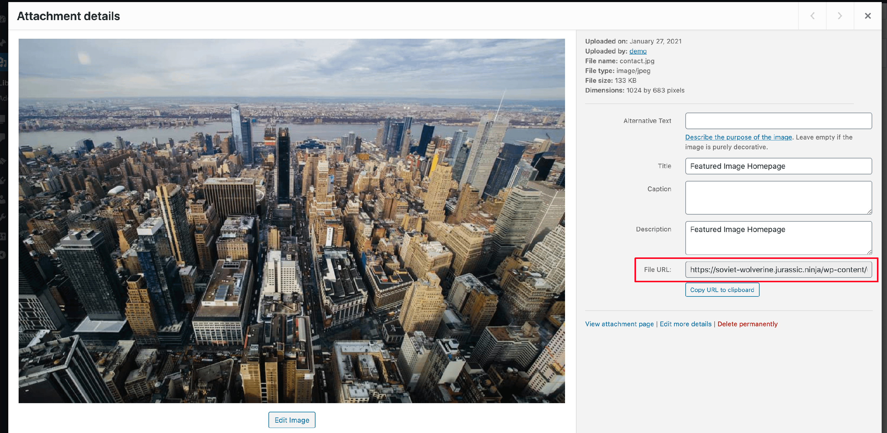
1. Upload a second image ( which you want to use on mobile ) in the media library and get its File URL.
2. Navigate to Appearance > Customize > Additional CSS and add the following code. Make sure you replace mobile_big_title_background.jpg with the File URL from step 1.
@media only screen and (max-width:500px){
  .home .header-filter{
     background-image: url("mobile_big_title_background.jpg") !important;
  }
}