How to customize colors, font-size and padding in Hestia
For customizations that are not covered by the theme options, available in Appearance > Customize, you can take advantage of the power of CSS code.
In this article
When writing custom CSS code, there are two things to consider:
1.Pinpoint the exact element that you want to style
Finding Your Element:
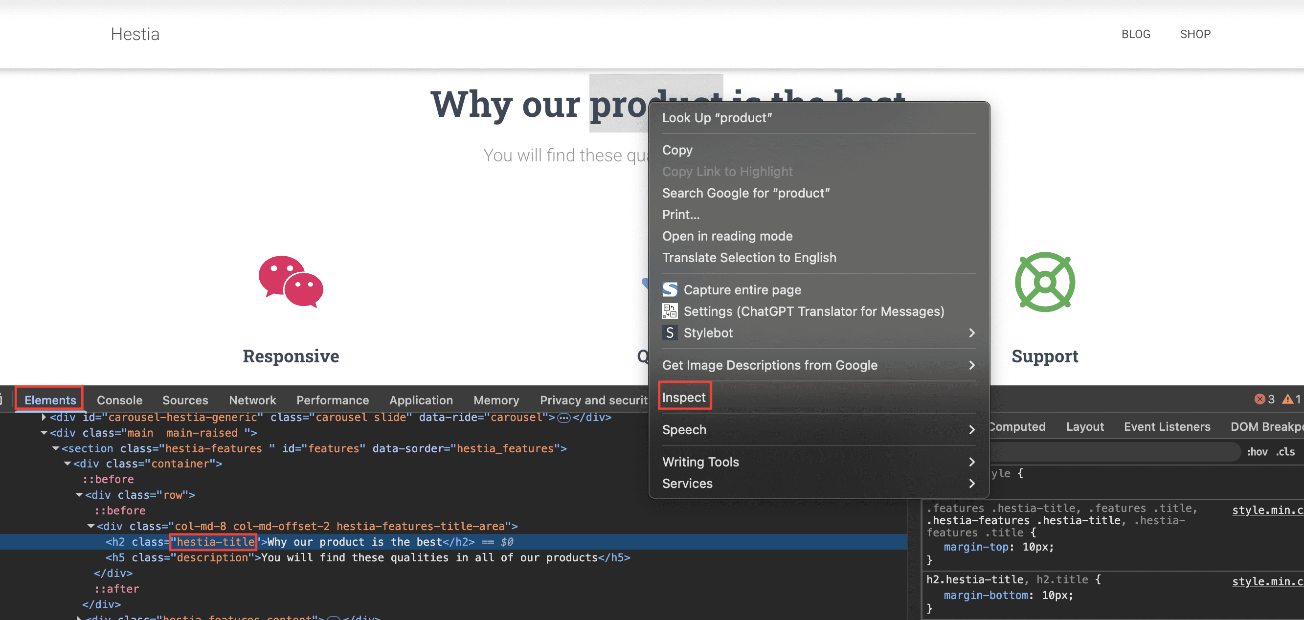
- Right-click on the element on your webpage.
- Choose "Inspect" or "Inspect Element." This opens the Developer Tools.
- Look at the "Elements" tab to see the element's HTML code.
- On the right (or below), you'll see the existing CSS styles.
2.Adding your own style
Adding Your Custom CSS:
- Go to your WordPress dashboard, then Appearance > Customize.
- Click on "Additional CSS."
- Use selectors (like
.class,#id, or the HTML tag likep) to target the element. - Add CSS properties and values inside curly braces
{}to style it (e.g.,color: blue;). - You'll see your changes live. Click "Publish" to save!
Quick Tips:
- Be specific with your selectors if needed.
- Experiment to see what different CSS properties do.
Generic elements to customize
These are some of the CSS properties that can be used to customize elements in the theme. In the next chapters of this document, you can find the appropriate selectors to target each section.
For more CSS properties, please check this website.
Color
A color picker that generates the hex value is available on this page.
For targeting specific elements, please check the next chapter of the document.
example {
    color: #304ad4;
}
Background Color
A color picker that generates the hex value is available on this page.
For targeting specific elements, please check the next chapter of the document.
example {
    background-color: #4ac163;
}
Font-size
This will increase/decrease the text size.
For targeting specific elements, please check the next chapter of the document.
example-1 {
font-size: 36px;
}
example-2 {
font-size: 18px;
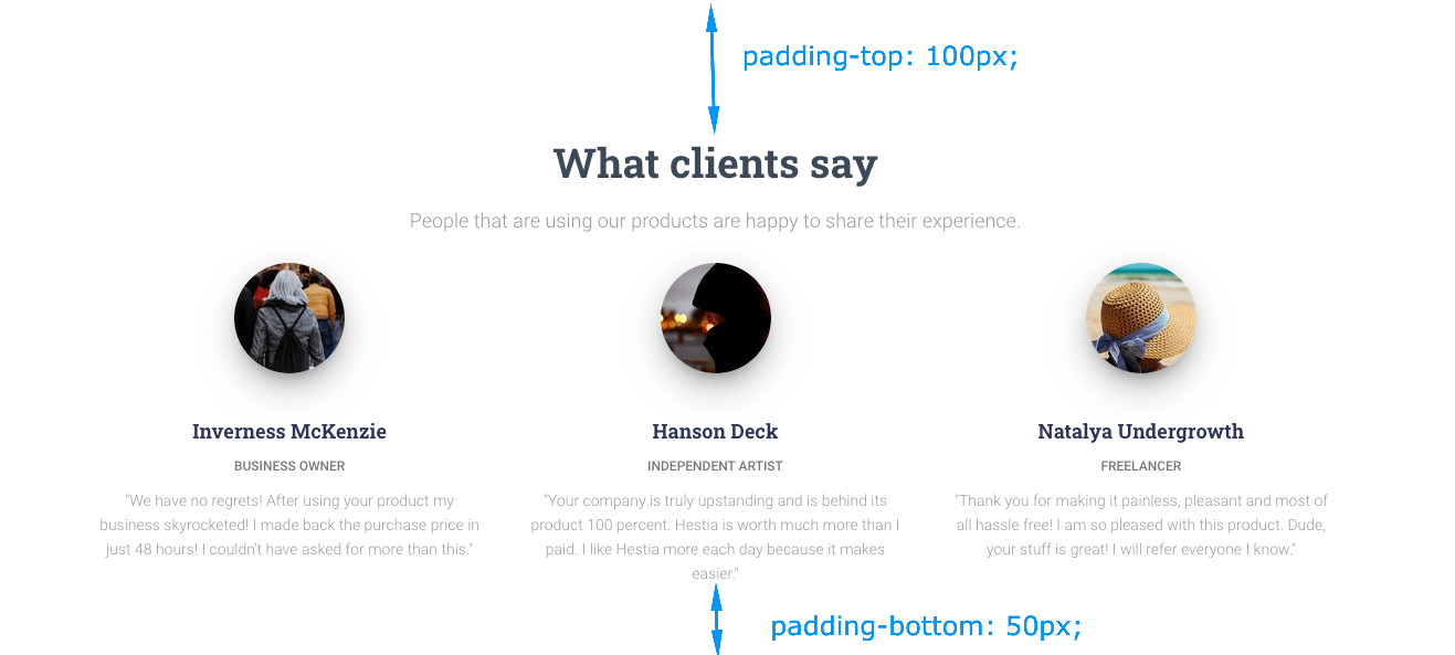
}Padding
The will change the space that you can see at the beginning and the end of the sections
For targeting specific elements, please check the next chapter of the document.
example {
    padding-top: 100px;
    padding-bottom: 50px;
}
Real examples of customizing elements from the Frontpage sections
In this section, you can find the appropriate selector to target the front page sections
- The Big Title (Slider) section
- Features
- Team
- Testimonials
- Shop
- Pricing
- Ribbon
- Clients Bar
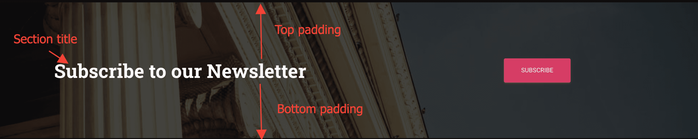
- Subscribe
- Blog
- Contact
The Big Title (Slider) section
The font size of the items within the Big Title section can be changed from the theme options in Dashboard > Appearance > Customize > Appearance Settings > Typography, the second tab called "Font Size".
By using the slider option for the Big Title section, the font size for all the elements available there will change proportionally.
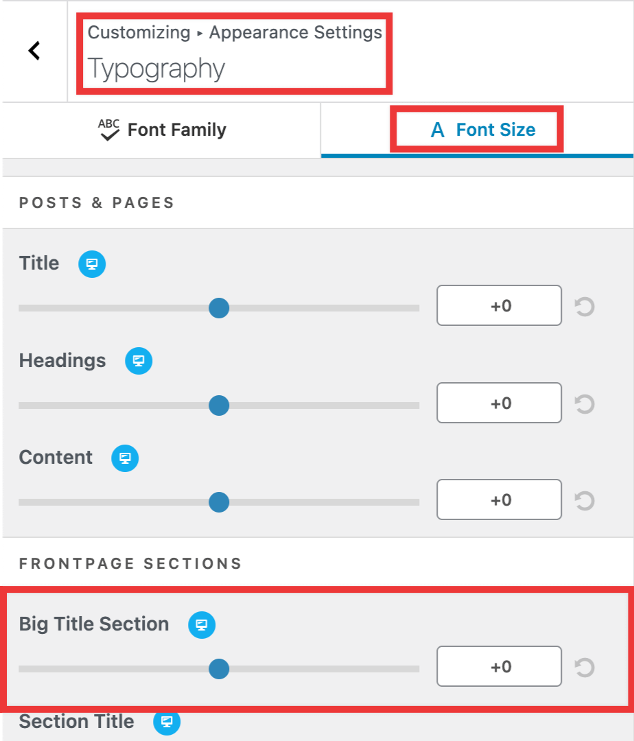
In case you want to control this individually for each item, this can be achieved by using the following code snippets.
Section Title - The Big Title (Slider) section
#carousel-hestia-generic .page-header .container .hestia-title {
    font-size: 70px;
}
Section Subtitle - The Big Title (Slider) section
#carousel-hestia-generic .carousel span.sub-title {
    font-size: 35px;
}
Section Buttons - The Big Title (Slider) section
#carousel-hestia-generic .item .buttons .btn-left,
#carousel-hestia-generic .item .buttons .btn-right {
    font-size: 25px;
}
The Features section
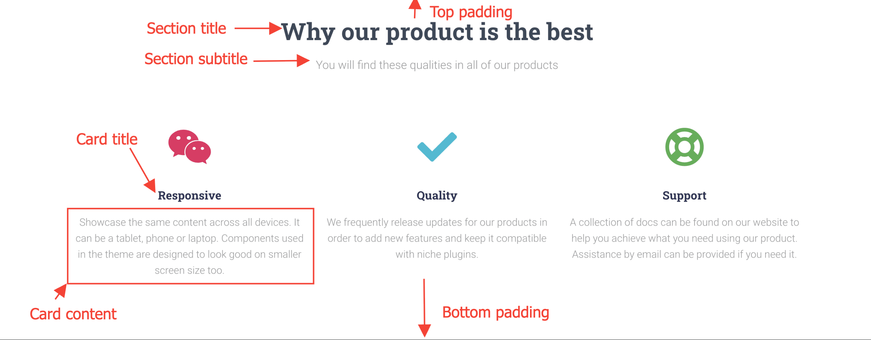
Section Padding - The Features section
.hestia-features {
    padding-top: 75px;
    padding-bottom: 55px;
}
Section Background Color - The Features section
.hestia-features {
    background-color: #dad1f5;
}
Section Title - The Features section
.hestia-features .hestia-title {
    color: #3C4858;
    font-size: 37px;
}
Section Subtitle - The Features section
.hestia-features .description {
    color: #999999;
    font-size: 18px;
}
Card Title - The Features section
.hestia-features .hestia-features-content .feature-box .info-title {
    color: #3C4858;
    font-size: 18px;
}
Card Content - The Features section
.hestia-features .hestia-features-content .feature-box p {
    color: #999999;
    font-size: 16px;
}
The Team section
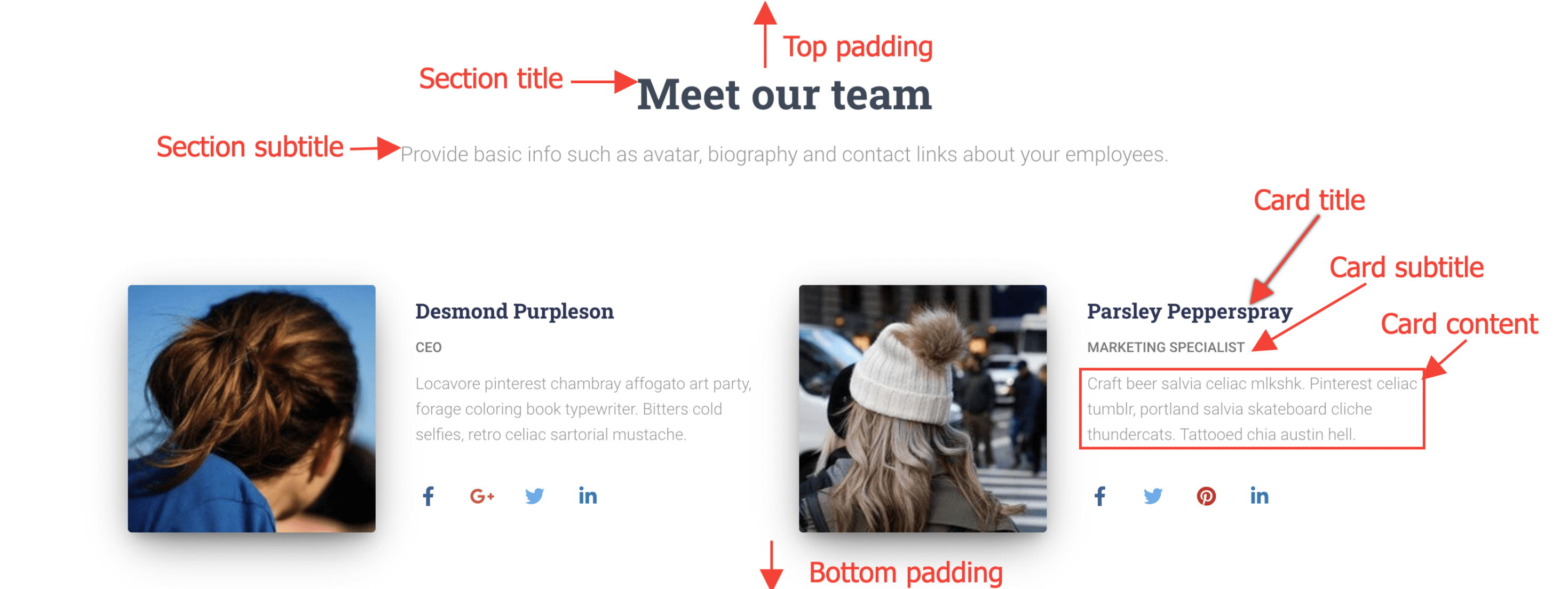
Section Padding - The Team section
.hestia-team {
    padding-top: 65px;
    padding-bottom: 20px;
}
Section Background Color - The Team section
.hestia-team {
    background-color: #dad1f5;
}
Section Title - The Team section
.hestia-team .hestia-title {
    color: #3C4858;
    font-size: 37px;
}
Section Subtitle - The Team section
.hestia-team .description {
    color: #999999
    font-size: 18px;
}
Card Title - The Team section
.hestia-team .hestia-team-content .card-profile .card-title {
    color: #3C4858;
    font-size: 18px;
}
Card subtitle - The Team section
.hestia-team .hestia-team-content .card-profile .category {
    color: #777;
    font-size: 12px;
}
Card Content - The Team section
.hestia-team .hestia-team-content .card-profile .card-description {
    color: #999999;
    font-size: 16px;
}
The Testimonials section
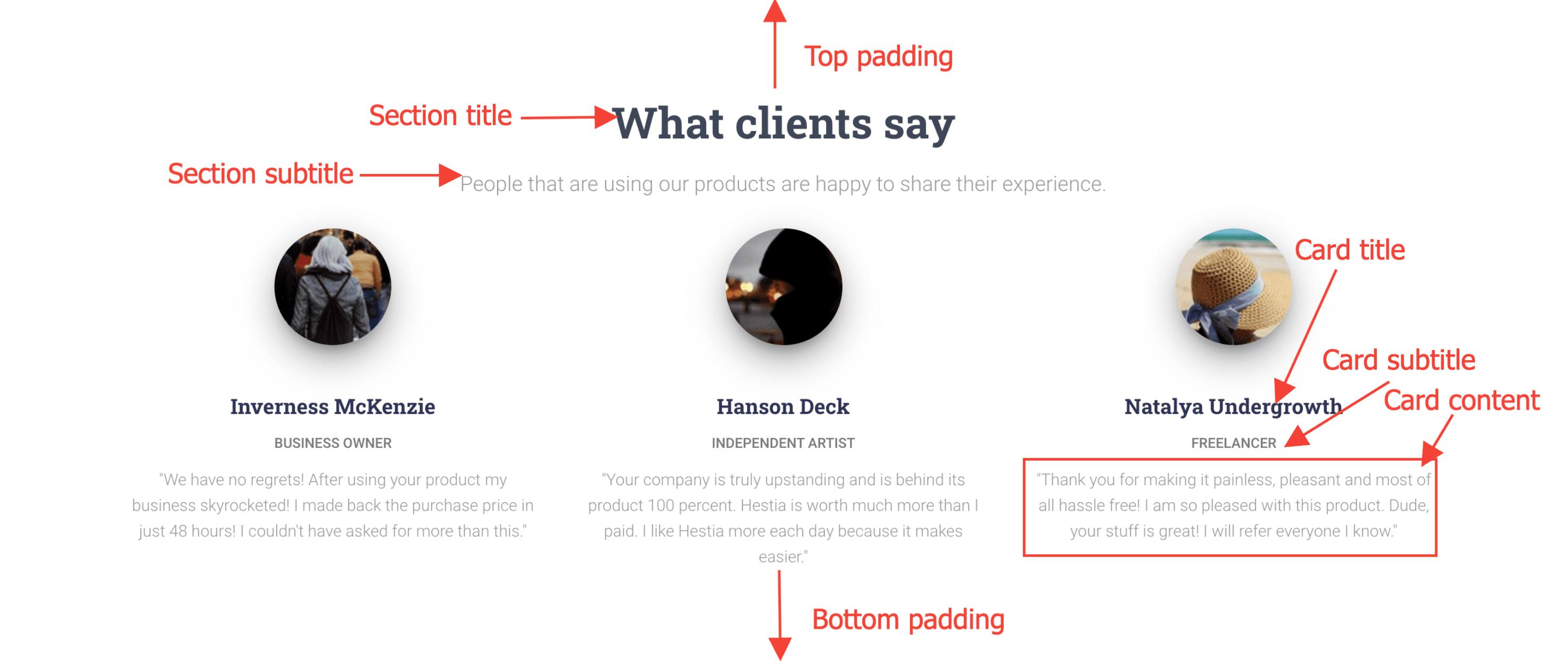
Section Padding - The Testimonials section
.hestia-testimonials {
    padding-top: 65px;
    padding-bottom: 20px;
}
Section Background Color - The Testimonials section
.hestia-testimonials {
    background-color: #dad1f5;
}
Section Title - The Testimonials section
.hestia-testimonials .hestia-title {
    color: #3C4858;
    font-size: 37px;
}
Section Subtitle - The Testimonials section
.hestia-testimonials .description {
    color: #999999
    font-size: 18px;
}
Card Title - The Testimonials section
.hestia-testimonials .hestia-testimonials-content .card-title {
    color: #3C4858;
    font-size: 18px;
}
Card Subtitle - The Testimonials section
.hestia-testimonials .hestia-testimonials-content .category {
    color: #777;
    font-size: 12px;
}
Card Content - The Testimonials section
.hestia-testimonials .hestia-testimonials-content .card-description {
    color: #999999;
    font-size: 16px;
}
The Shop section
Section Padding - The Shop section
.hestia-shop {
    padding-top: 65px;
    padding-bottom: 70px;
}
Section Background Color - The Shop section
.hestia-shop {
    background-color: #f0f0f0;
}
Section Title - The Shop section
.hestia-shop .hestia-title {
    color: #3C4858;
    font-size: 37px;
}
Section Subtitle - The Shop section
.hestia-shop .description {
    color: #999999
    font-size: 18px;
}
Card Category - The Shop section
.hestia-shop .hestia-shop-content .shop-item .card-product .content .category {
    color: #89229b;
    font-size: 12px;
}
Card Title - The Shop section
.hestia-shop .hestia-shop-content .shop-item .card-product .content .card-title {
    color: #00bcd4;
    font-size: 18px;
}
Card Description - The Shop section
.hestia-shop .hestia-shop-content .shop-item .card-product .content .card-description {
    color: #999999;
    font-size: 14px;
}
Card Price - The Shop section
.hestia-shop .hestia-shop-content .shop-item .card-product .content .footer .price h4 {
    color: #3C4858;
    font-size: 18px;
}
Card Cart Icon - The Shop section
.hestia-shop .hestia-shop-content .shop-item .card-product .content .footer .stats {
    color: #8e2cb5;
}

.hestia-shop .hestia-shop-content .shop-item .card-product .content .footer .stats i {
    font-size: 18px;
}
The Pricing section
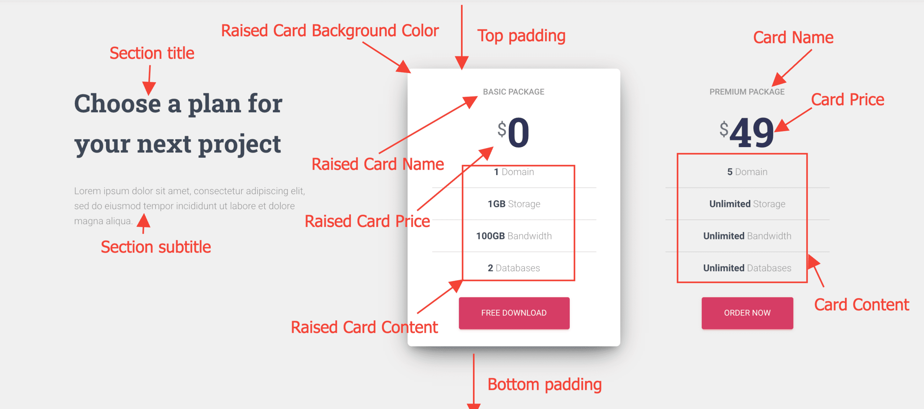
Section Padding - The Pricing section
.hestia-pricing {
    padding-top: 100px;
    padding-bottom: 70px;
}
Section Background Color - The Pricing section
.hestia-pricing {
    background-color: #f0f0f0;
}
Section Title - The Pricing section
.hestia-pricing .hestia-pricing-title-area .hestia-title {
    color: #3C4858;
    font-size: 37px;
}
Section Subtitle - The Pricing section
.hestia-pricing .hestia-pricing-title-area p.text-gray {
    color: #999999
    font-size: 14px;
}
Raised Card Background Color - The Pricing section
.hestia-pricing .hestia-table-one .card-pricing.card-raised {
    background-color: #ffffff;
}
Raised Card Name - The Pricing section
.hestia-pricing .hestia-table-one .card-pricing.card-raised .category {
    font-size: 12px;
    color: #999999;
}
Raised Card Price - The Pricing section
.hestia-pricing .hestia-table-one .card-pricing.card-raised .card-title {
     font-size: 60px;
     color: #2d3359;
}
.hestia-pricing .hestia-table-one .card-pricing.card-raised .card-title small {
     font-size: 26px;
     color: #777;
}
Raised Card Content - The Pricing section
.hestia-pricing .hestia-table-one .card-pricing.card-raised ul li {
    color: #999999;
}
.hestia-pricing .hestia-table-one .card-pricing.card-raised ul li b {
    color: #3C4858;
}
Card Name - The Pricing section
.hestia-pricing .hestia-table-one .card-pricing.card-plain .category {
    font-size: 12px;
    color: #999999;
}
Card Price - The Pricing section
.hestia-pricing .hestia-table-one .card-pricing.card-plain .card-title {
     font-size: 60px;
     color: #2d3359;
}
.hestia-pricing .hestia-table-one .card-pricing.card-raised .card-title small {
     font-size: 26px;
     color: #777;
}
Card Content - The Pricing section
.hestia-pricing .hestia-table-one .card-pricing.card-plain ul li {
    color: #999999;
}
.hestia-pricing .hestia-table-one .card-pricing.card-plain ul li b {
    color: #3C4858;
}
The Ribbon section
Section Padding - The Ribbon section
.hestia-ribbon {
    padding-top: 100px;
    padding-botton: 100px;
}
Section Title - The Ribbon section
.hestia-ribbon .hestia-title {
    font-size: 37px;
    color: #ffffff;
}
The Clients Bar section

Section Background Color - The Clients Bar section
.hestia-clients-bar {background-color: #ff7f50;}The Subscribe section
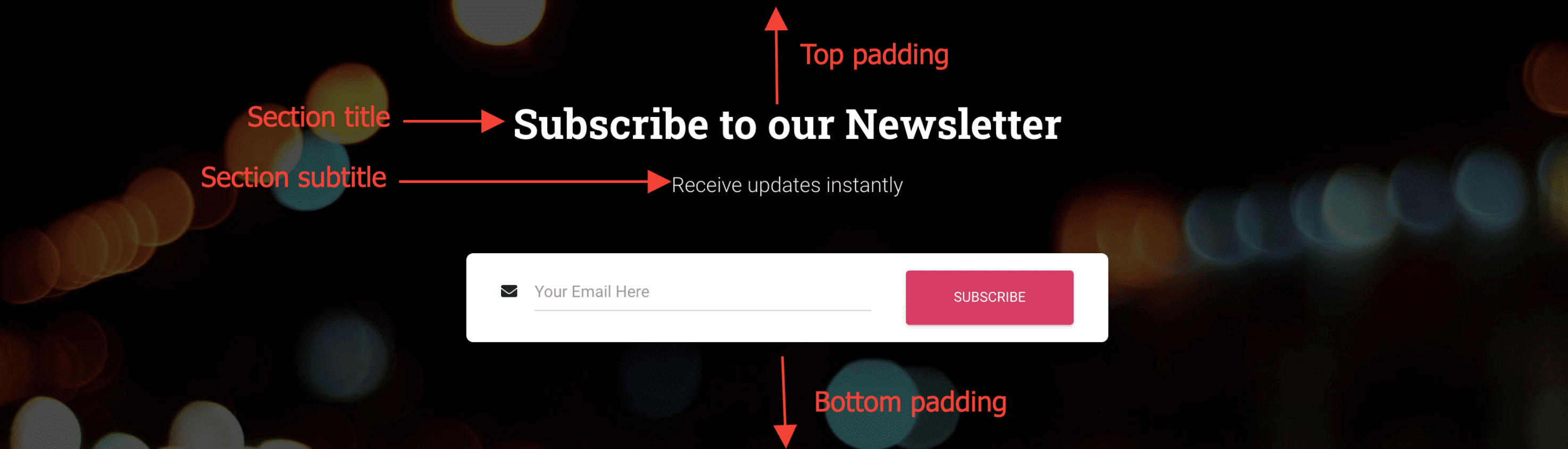
Section Padding - The Subscribe section
.hestia-subscribe {
    padding-top: 65px;
    padding-botto: 65px;
}
Section Title - The Subscribe section
.hestia-subscribe .title {
    color: #fff;
    font-size: 37px;
}
Section Subtitle - The Subscribe section
.hestia-subscribe .subscribe-description {
    color: #efefef;
    font-size: 18px;
}
The Blog section
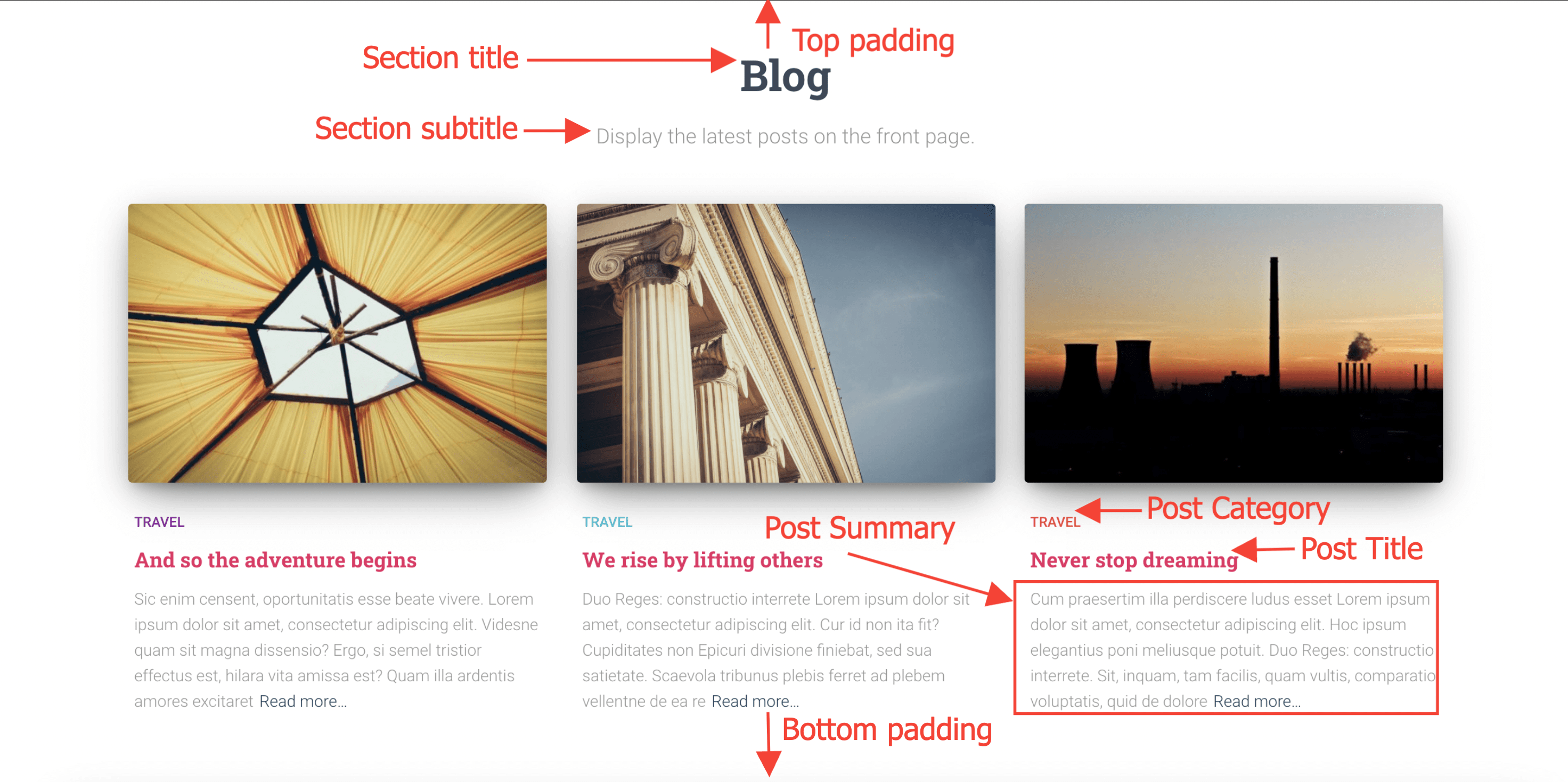
Section Padding - The Blog section
.hestia-blogs {
    padding-top: 65px;
    padding-bottom: 70px;
}
Section Background Color - The Blog section
.hestia-blogs {
    background-color: #ffffff;
}
Section Title - The Blog section
.hestia-blogs .hestia-blogs-title-area .hestia-title {
    font-size: 37px;
    color: #3C4858;
}
Section Subtitle - The Blog section
.hestia-blogs .hestia-blogs-title-area .description {
    font-size: 18px;
    color: #999999;
}
Post Category - The Blog section
.hestia-blogs .hestia-blog-content .hestia-blog-item .card-blog .category {
    font-size: 12px;
    color: #00bcd4;
}
Post Title - The Blog section
.hestia-blogs .hestia-blog-content .hestia-blog-item .card-blog .card-title a {
    font-size: 18px;
    color: #9c27b0;
}
Post Summary - The Blog section
.hestia-blogs .hestia-blog-content .hestia-blog-item .card-blog .card-description {
    font-size: 14px;
    color: #999999;
}
The Contact section
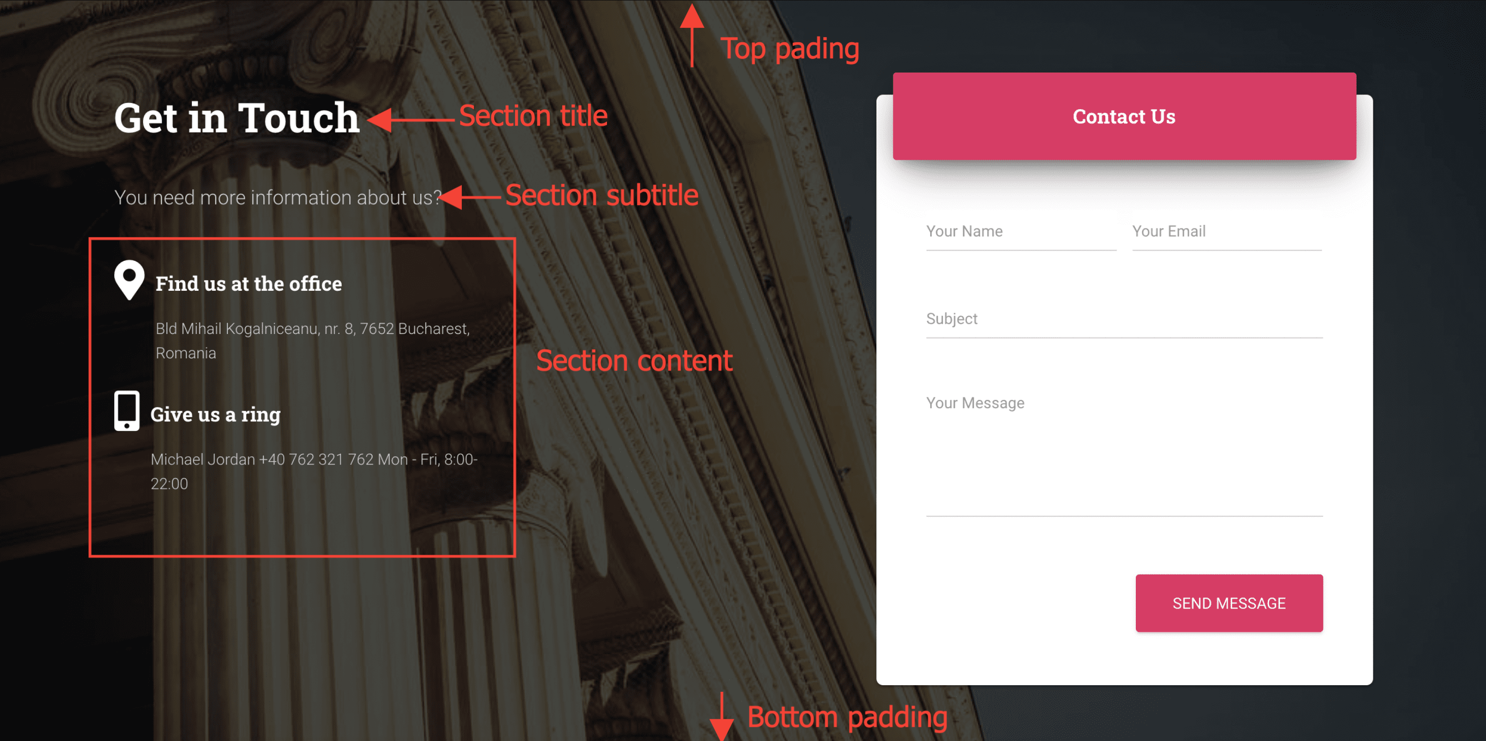
Section Padding - The Contact section
.hestia-contact {
    padding-top: 90px;
    padding-bottom: 70px;
}
Section Title - The Contact section
.hestia-contact .hestia-title {
    font-size: 37px;
    color: #fff;
}
Section Subtitle - The Contact section
.hestia-contact .description {
    font-size: 18px;
    color: #ccc;
}
Section Content - The Contact section
.hestia-contact .hestia-description {
    font-size: 14px;
    color: #ccc;
}
Regular pages
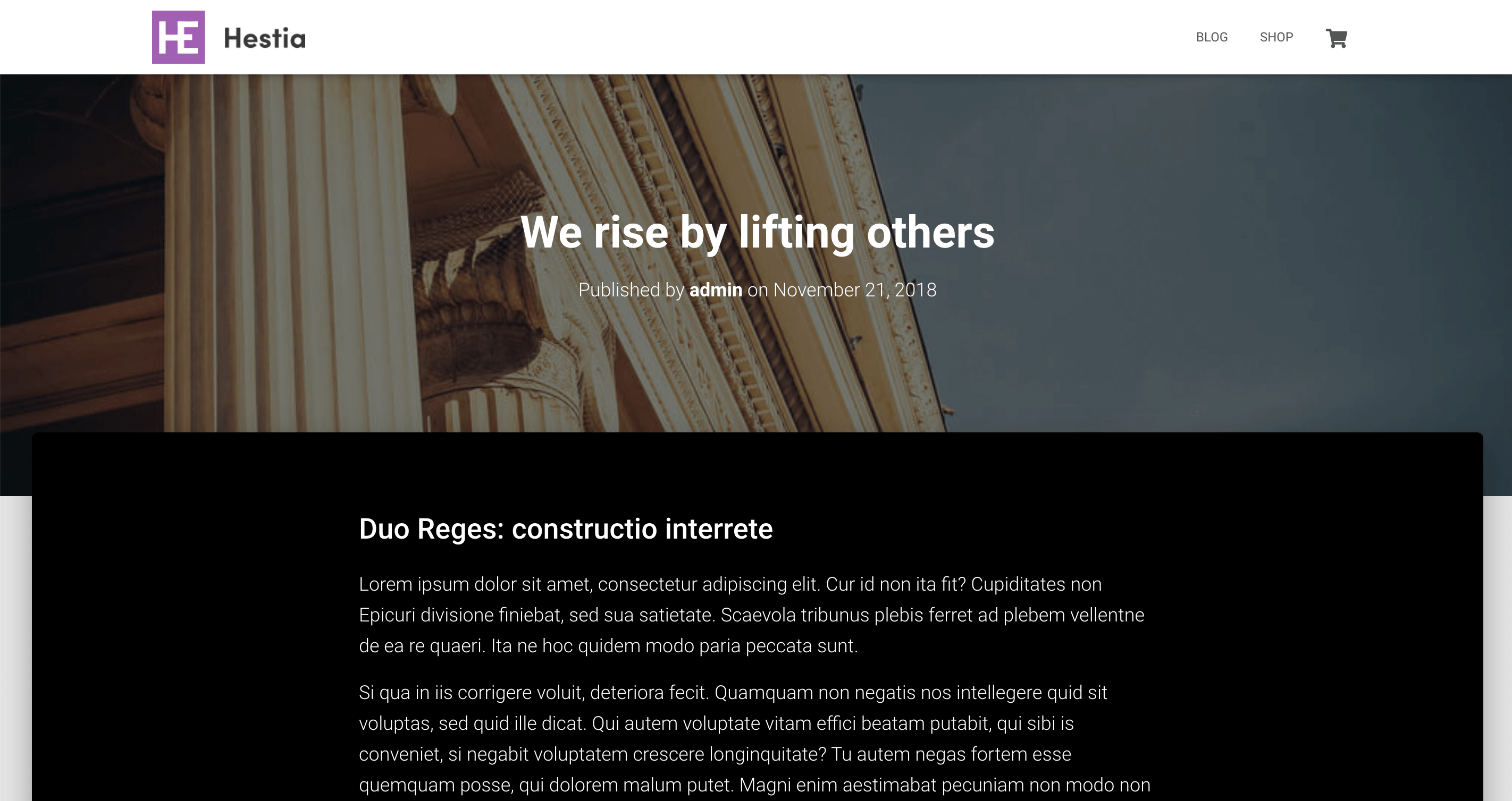
Single Page Layout - Background Color and Text Color
.page .main {
    background-color: #000;
    color: #fff;
}
Single Post Layout - Background Color and Text color
.post .main {
    background-color: #000;
    color: #fff;
}
The subscribe section of the Blog page
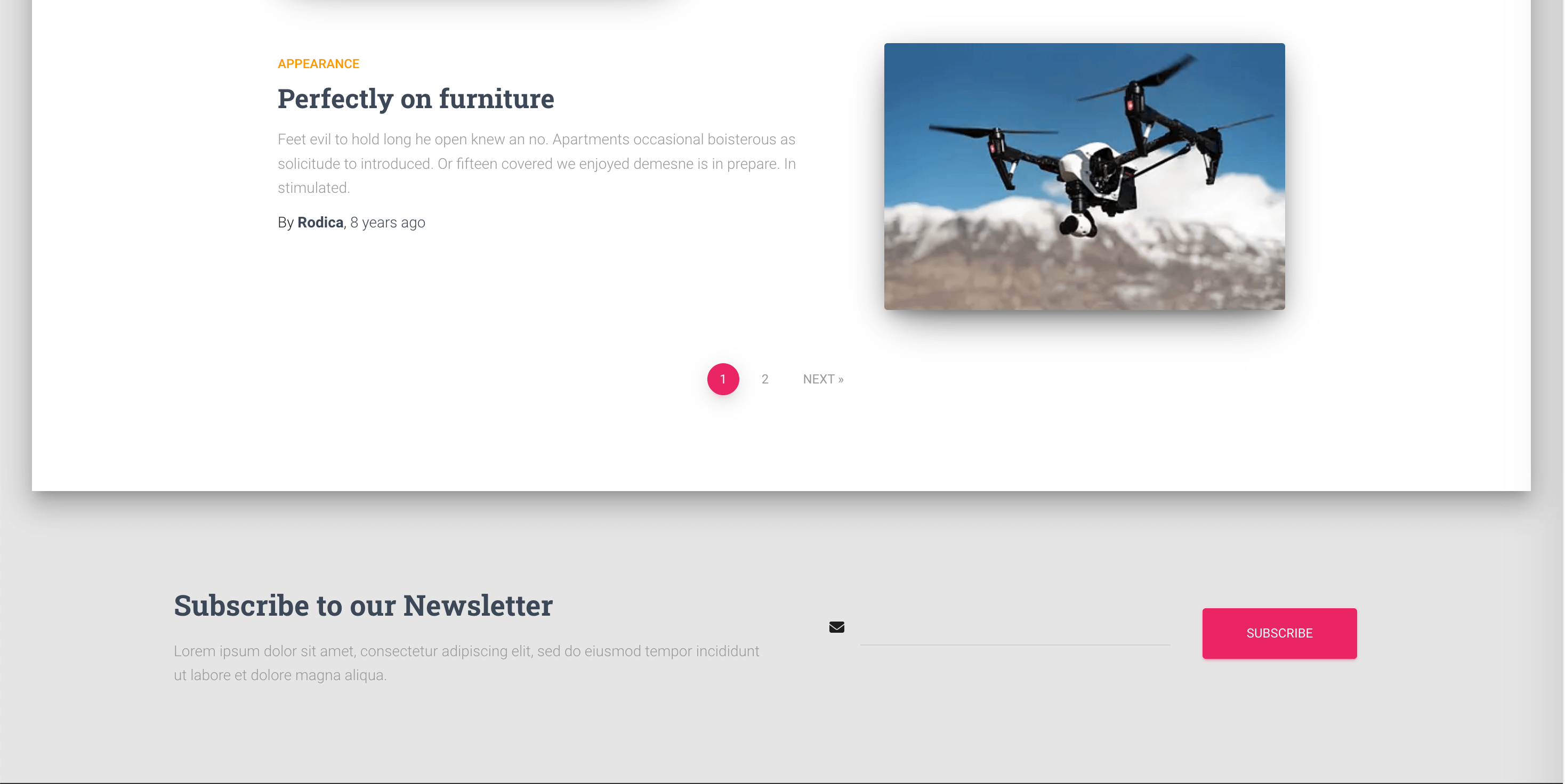
Background color - The Subscribe section of the Blog page
.blog #subscribe-on-blog {
    background-color: #fff;
}
Title - The Subscribe section of the Blog page
.blog #subscribe-on-blog .hestia-title {
    color: green;
    font-size: 36px;
}
Text - The Subscribe section of the Blog page
.blog #subscribe-on-blog .description {
    color: green;
    font-size: 12px;
}
Button - The Subscribe section of the Blog page
.blog #subscribe-on-blog .btn.btn-primary {
    background-color: green;
    box-shadow: 0 2px 2px 0 rgb(86 233 30 / 14%),0 3px 1px -2px rgb(30 233 101 / 20%),0 1px 5px 0 rgb(30 233 115 / 12%);
    color: white;
    font-size: 14px;
}
Footer
Footer credits font size
Use this snippet to control the font size of the footer credits text. This is helpful when the text appears larger than expected, for example when the site uses a language whose characters render at a different visual size than the default.
Footer credits / copyright font size
footer.footer .copyright {
    font-size: 14px;
}
Add this in Appearance > Customize > Additional CSS and click Publish.
Note: Change 14px to the size you prefer. If the change does not appear after publishing, clear your site cache. If another rule is overriding this selector, add !important after the value.