Why background images aren't responsive
When using WordPress themes or plugins, some of the images might seem not responsive. This means that only a part of the image is visible on mobile devices.
In this guide, we will explain why this happens.
Let's take the following image as an example. It should be pretty obvious when the entire image is not visible.
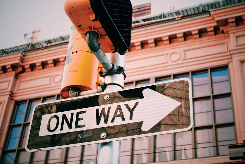
Image in content
On the following page, the image is added to the content, so it doesn't need to have a dynamic dimension, and it can keep its aspect ratio.
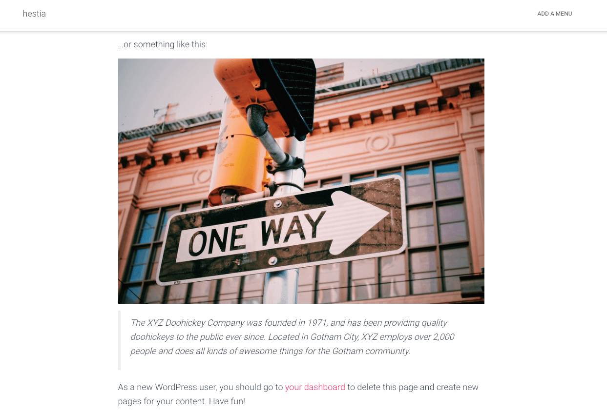
Image in content on Desktop
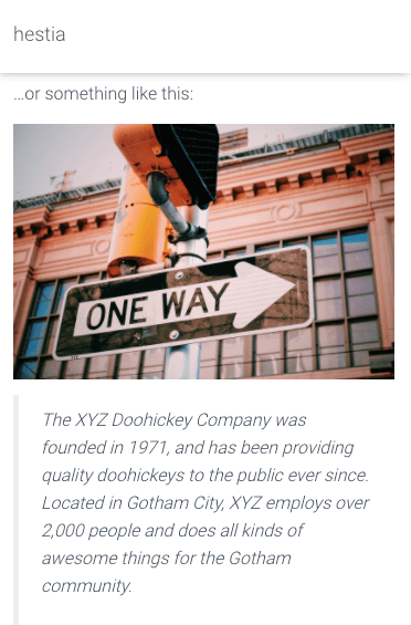
Image in content on Mobile
Image as a background
On the following page, the image is used as the background of the Big Title Section. That's why, the image purpose is to cover the entire background of the section, without repeating itself.
In this situation, the image can't keep its aspect ratio, as it needs to cover the entire section, therefore, a mobile screen doesn't have enough space to render the whole width of the image.
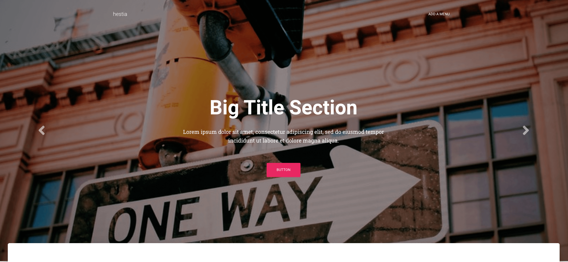
Image as background on Desktop
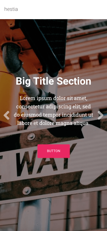
Image as background on Mobile