Pro Charts Library
📝 Note: These charts are part of Visualizer: Charts and Graphs Pro, which you can get from here. Take a look at the complete documentation of the plugin here.
Visualizer offers 11 extra charts for users of the Pro Version, apart from the basic charts type of the free version ( Table, Pie, Bar, Line ). Now you can enhance your users' experience with the data using these stunning charts.
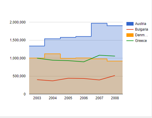
- Area Chart - displays tips when hovering over points.
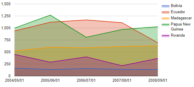
📌 GoogleChart: Here is dedicated documentation about the Area Chart.
- Geo Chart - represents a map of a country/continent/region.
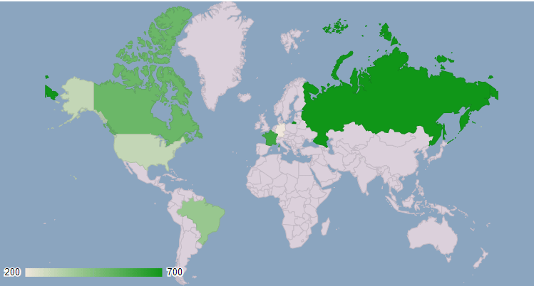
📌 GoogleChart: Here is dedicated documentation about the Geo Chart.
- Column Chart - displays tooltips when the user hovers over the data.
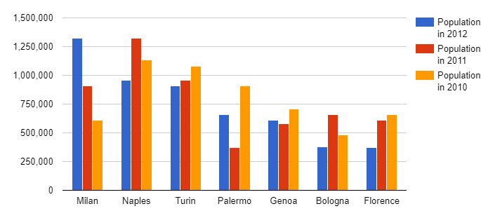
📌 GoogleChart: Here is dedicated documentation about the Column Chart.
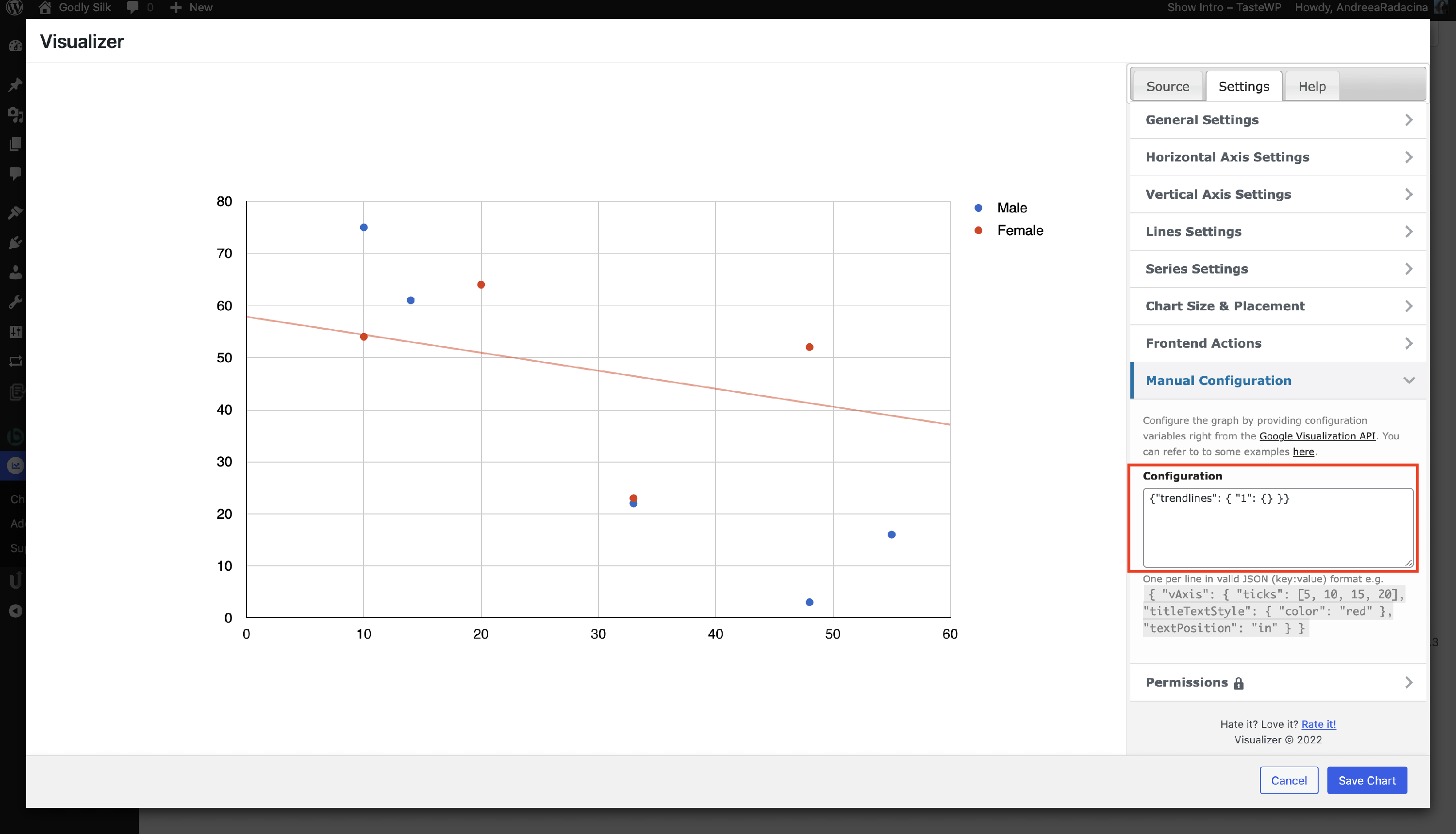
- Scatter Chart - contains a line chart with the x-axis changed to a linear axis.
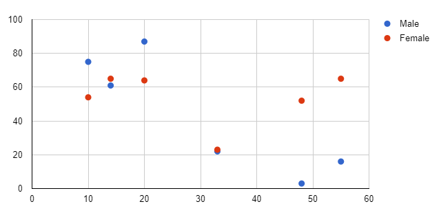
📌 GoogleChart: Here is dedicated documentation about the Scatter Chart.
📌 Chart.js: Here is dedicated documentation about the Scatter Chart.
It is possible, using Visualizer, to represent trendlines in the Scatter Chart using the manual configuration ( Edit Chart > Settings > Manual Configuration ) by adding this code in the field:
{"trendlines": { "0": {} }}or
{"trendlines": { "1": {} }}The number within the code ( 0 and 1 ) represents the data set in the Scatter Chart. You can replace it according to your set.
💡Result
- Bubble Chart - used to display three dimensions of data at the same time.
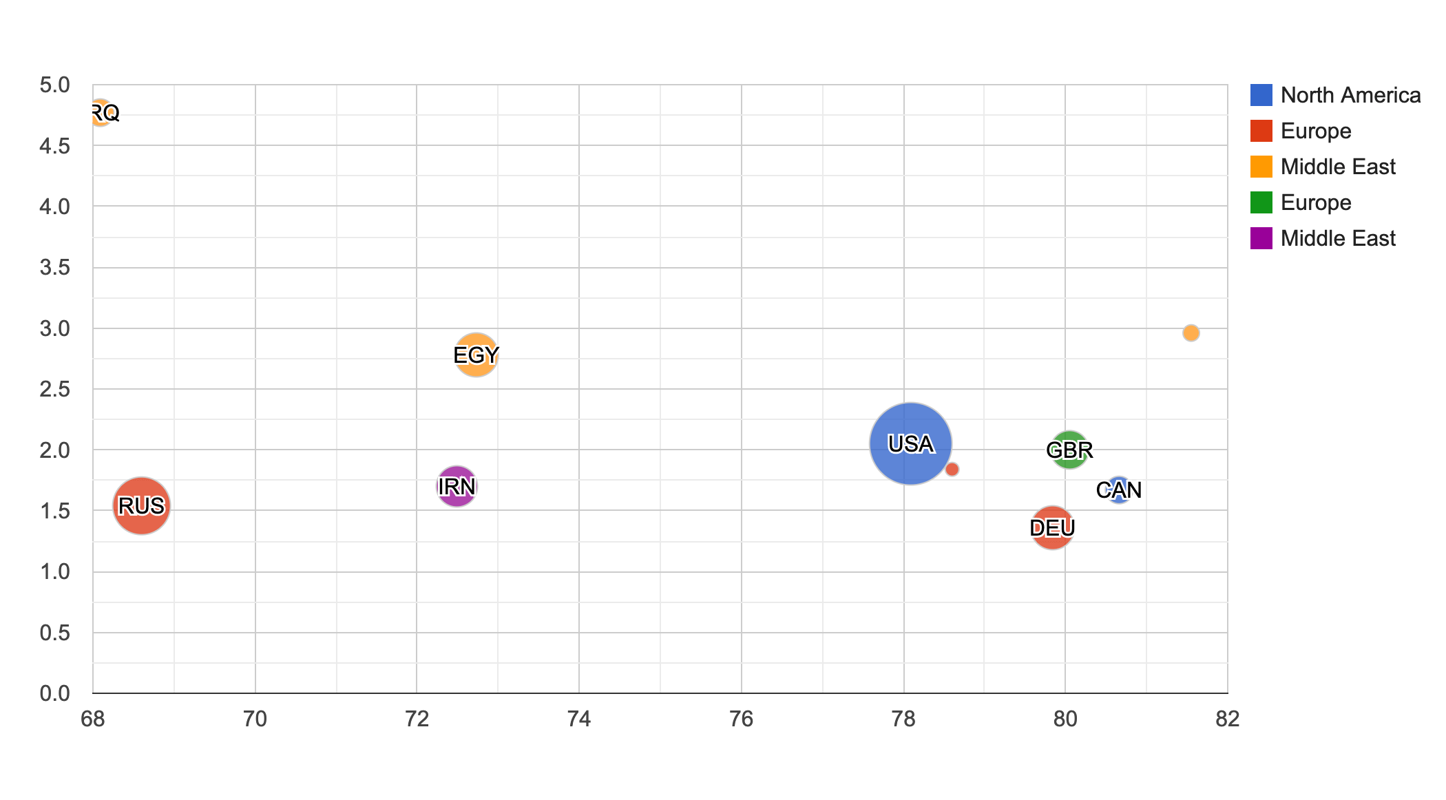
📌 GoogleChart: Here is dedicated documentation about the Bubble Chart.
📌 Chart.js: Here is dedicated documentation about the Bubble Chart.
- Gauge Chart - is represented by a gauge with a dial.
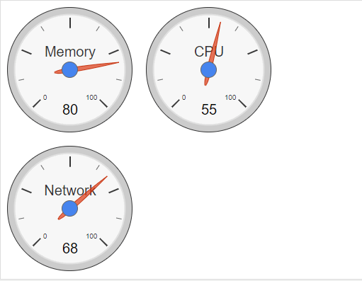
📌 GoogleChart: Here is dedicated documentation about the Gauge Chart.
- Candlestick Chart - used to show an opening and closing value overlaid on top of the total variance.
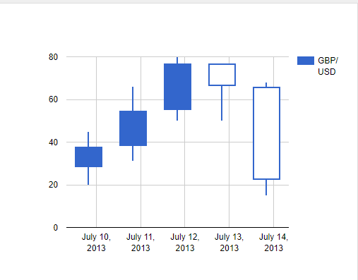
📌 GoogleChart: Here is dedicated documentation about the Candlestick Chart.
- Timeline Chart - depicts how a set of resources are used over time.
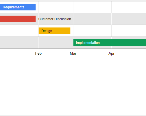
📌 GoogleChart: Here is dedicated documentation about the Timeline Chart.
- Combo Chart - lets the user render each series as a different marker type.
📌 GoogleChart: Here is dedicated documentation about the Combo Chart.
- Polar Chart - used for the comparison data, showing a scale of values for context.
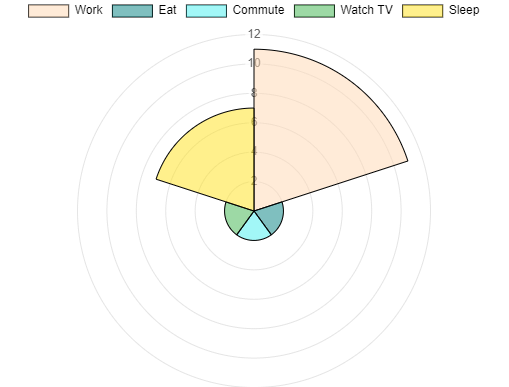
📌 Chart.js: Here is dedicated documentation about the Polar Chart.
- Radar Chart - shows multiple data points and the variation between them.
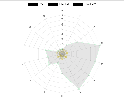
📌 Chart.js: Here is dedicated documentation about the Radar Chart.